The Anatomy of a Great Static Ad: Creative Examples from 2026
Ever wonder why your static ads look great in the design file but fall flat the moment they hit the feed?
Static ads look simple, but they're the easiest place to burn budget fast. A weak hook or visual, a cluttered layout, or a misplaced offer can tank installs, sales, and subscriptions long before you catch it. And today, when attention is shorter and CPMs are higher, a bad static ad doesn’t just underperform; it drags your entire UA strategy down with it.
So, if you want to understand why some static ads scale effortlessly while others die in the first 500 impressions, this blog is for you. Here, you explore the exact anatomy of a high-performing static ad in 2026, plus real examples and creative patterns, you can use to build static ads that convert consistently across all your UA channels.
What is a Static Ad?
A static ad is a fixed single-image creative that looks the same to every viewer, regardless of where it appears. It doesn’t change based on the platform, device, or user behavior. Whether someone sees it on Instagram, Facebook, mobile, or desktop, the image and message stay the same. This consistency makes static ads fast to produce, easy to test, and a reliable format for finding winning concepts across your UA channels.
For example, if a clothing brand creates a static ad and places it online, every viewer will see the exact same ad. The content, image, and message remain identical across all placements.
Here are key scenarios where static ads perform best:
Great for introducing a new game feature, product angle, or subscription benefit with a clear, focused message.
Ideal when you want to test multiple concepts without spending heavily on production.
Useful in regions with slow networks because static ads load faster than videos.
Best for running quick A/B tests to validate hooks, visuals, offers, or characters within the first few hundred impressions.
Once you know what static ads are, the next question is why they remain essential for high-performance acquisition.
Also Read: Creating and Scaling Static Ads: Strategies and Use Cases
Why Choose Static Ads?
Static ads are one of the fastest ways to test and scale creative ideas in your UA campaigns. They help you find winning angles early, without heavy production work or delays. If you want quick, creative learning and low-risk experiments, static ads are your best starting point.
Here are the key reasons to use static ads:
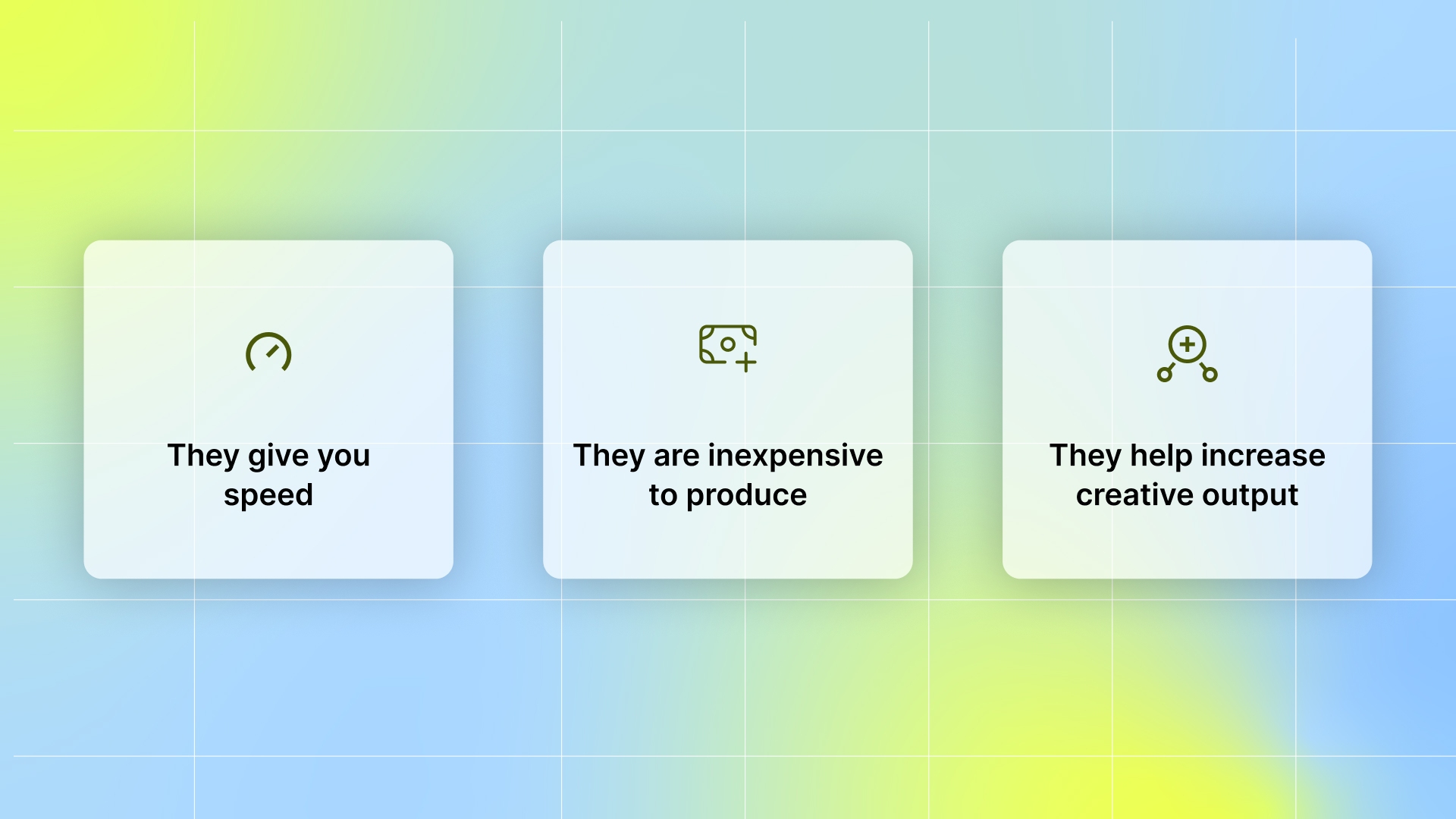
They give you speed: You can create, test, and ship static ads much faster than videos. No long approvals, no complicated edits, just rapid creative learning across all your UA channels.
They are inexpensive to produce: If a video creative fails, you lose time and money. Static ads are cheaper, easier to scale, and perfect for testing new concepts before investing in bigger productions.
They help you generate more creative volume: Static ads allow you to produce multiple variations quickly—perfect for UA teams that need constant testing velocity across gaming, DTC, and subscription funnels.
With Segwise’s AI creative generation, you can create multiple new ad creative variations with a click of a button, using your proven winning creative elements like hooks, CTAs, visual styles, etc., that actually drive ROAS and conversions.
They’re ideal for concept testing: Want to test hooks, offers, product angles, characters, or headlines? Static ads show you what works before you turn it into bigger creative assets.
They perform well across multiple platforms: Asingle strong static creative can run effectively on Meta, TikTok, Google, Snap, and DSPs without needing separate edits, making scaling easier for your UA team.
And once you know why static ads matter, the next step is understanding what actually makes one perform.
The Anatomy of Static Ads
A strong static ad works because every element has a clear purpose. With only one frame to earn attention, each visual choice and line of copy must guide the user toward action. When you build your static ads with intention, you get cleaner signals, faster learning, and better performance across your UA campaigns.
Here are the core elements that make a great static ad:
1. Scroll-stopping visuals
Your visual is the first thing users notice, and it decides whether they pause or scroll past. A strong static ad uses contrast, bold colors, and a clear focal point to catch attention in under a second. For mobile games, this means showing a dramatic level challenge or a character expression instantly pulls players in because it sparks curiosity about gameplay.
2. Snappy copy and headlines
Your headline must communicate value fast. Users don’t read long paragraphs; they scan for quick, meaningful cues. A short, sharp line can instantly tell the user what’s in it for them. For your skincare brand, a line like “Glow in 30 Days” gives a clear, outcome-driven message that pushes users to stop and consider the product.
3. Clear call to action
Your CTA guides the user toward the next step, so it needs to be visible, direct, and aligned with your campaign goal. A strong CTA reduces friction and boosts click intent. For your app, “Try Free” works well because it highlights low commitment and encourages users to explore value before paying.
4. Mobile-first composition
Most impressions happen on mobile, so your layout must be clean, readable, and optimized for small screens. Big fonts, simple spacing, and uncluttered visuals always win. For DTC campaigns, this means a product photo paired with a bold, easy-to-read benefit performs far better when the text is large enough to stand out instantly in a mobile feed.
5. Creative clarity
A great static ad communicates one message, one value prop, and one action. When the user understands the ad instantly, performance improves. For a DTC brand, this means showing a single hero product with one benefit keeps the message clean and prevents confusion.
If you want even more creative clarity backed by deep data insights, Segwise helps you. With tag-level creative element mapping, you can see which creative elements, themes, and formats actually drive performance across your campaigns.
Knowing the core anatomy is essential, but real performance gains happen when you layer in advanced tactics that elevate every element of your static ads.
Advanced Strategies to Craft High-Performing Static Ads
Static ads may be simple, but the tactics top UA teams use to drive conversions have evolved. To stay competitive, you need strategies shaped by data, AI, and real user behavior, not guesswork.
Here are the advanced strategies that help you produce static ads with a higher chance of winning:
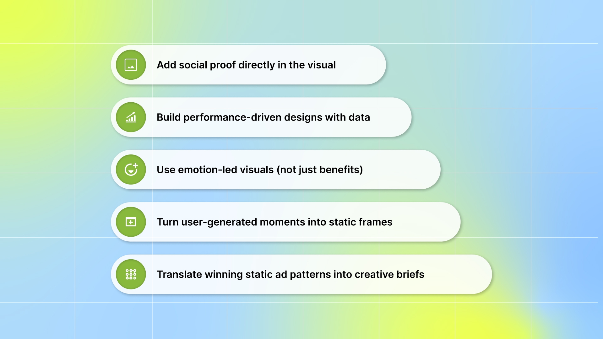
1. Add social proof directly in the visual
Social proof builds instant trust and helps users feel more confident about clicking or installing. Even small credibility cues can shift user behavior, especially in fast-scrolling feeds.
You can apply this strategy by adding small trust signals, such as “10M+ players,” “4.8★ rating,” or “Trusted by 500K users,” directly into the visual. Place these badges close to the product, character, or headline so users notice them without effort. Keep them subtle and supportive; the goal is to enhance the message, not overpower your design.
Why this work
Social proof reduces hesitation by showing users that others already trust your product. It makes decision-making faster because users rely on cues, not research. This instantly boosts conversions in fast-scrolling feeds.
2. Build performance-driven designs with data
Your own past creatives are the best source of truth. By using performance data, you remove guesswork from your design process.
Review your data to identify top-performing elements, such as colors, hooks, layouts, or character styles. Use those proven elements as the starting point for new creatives rather than relying on random ideas.
If you want an AI-powered platform that pulls all your performance data from ad networks and MMPs and helps you identify the creative patterns that actually drive results, use Segwise.
Segwise is an AI-powered creative analytics and generation platform that helps UA and performance marketing teams understand which creative elements drive performance, when creatives start fatiguing before results drop. It connects creative elements (hooks, dialogs, visuals, formats, etc.) directly to business outcomes (ROAS, CPA/CPI, LTV, IPM, conversion rates), so teams stop guessing what works and start scaling creatives with data-backed confidence.
Why this works
You remove guesswork and build on proven creative elements that already drive results. This makes every new static ad more predictable and higher quality. Over time, your team produces more winners and fewer wasted concepts.
3. Use emotion-led visuals (not just benefits)
Emotions drive faster decisions than pure logic, especially in a single-frame ad. Emotion-led visuals help users connect with your ad instantly.
Begin by choosing one emotion you want the user to feel: excitement, relief, confidence, clarity, or surprise. Design your visual around that emotional moment rather than focusing only on the product. Show the emotion clearly, such as the frustration before beating a level in a game. Finally, pair the visual with a headline that amplifies the emotion instead of just describing a feature.
Why this works
Emotions grab attention faster than features or text. When users feel something instantly, they stop scrolling and engage. Emotion-led ads consistently outperform neutral visuals across UA platforms.
4. Turn user-generated moments into static frames
UGC-style visuals feel native to social feeds and blend in naturally with user content. This boosts attention and trust without feeling like an ad.
How to use this strategy
Pull a freeze-frame from a testimonial, selfie video, unboxing clip, or gameplay reaction and turn it into a static ad. Keep the lighting, angles, and expressions raw instead of over-editing them. Add a short headline that complements the UGC moment without breaking authenticity. Use these UGC-based static frames especially in top-of-funnel testing to identify what resonates quickly.
Why this works
UGC looks natural in the feed, so users don’t immediately identify it as an ad. This builds trust and increases engagement. Real, imperfect moments often outperform polished studio visuals.
5. Translate winning static ad patterns into creative briefs
Strong creative briefs align your entire team, helping you produce fewer random ads and more intentional, test-ready concepts.
Create briefs that clearly define the hook, target audience, benefit, visual direction, and main KPI for the ad. Use insights pulled from your past winners to shape these briefs, rather than relying on preferences or guesses. Share the brief with your designers so they understand exactly what they are testing and why. Then, use the same brief to create multiple variations you can test side by side.
Why this works
Creative briefs give your team clarity, ensuring every variation is intentional rather than random. This improves creative quality and speeds up production. You waste less time and get more test-ready concepts that actually align with your KPIs.
The best way to understand these strategies in action is to look at how top brands apply them.
Static Ad Examples to Inspire Your Next Campaign
Great static ads follow clear creative principles, but the best way to learn is by seeing those principles in action. These examples show how top brands use visuals, offers, emotion, and clarity to drive real UA performance.
Here are static ad examples you can use as inspiration for your next campaign:
1. Lettoria: Leather Handbags Inspired by Classical Literature

Platform: Meta (Facebook & Instagram Feed)
Industry: DTC / Fashion & Accessories
This static ad from Lettoria features a Winnie-the-Pooh–themed handbag set against a warm autumn backdrop, with cozy props and colors that evoke a nostalgic, storybook feel.
The headline, “YOU CHOOSE ONE. WE CHOOSE ONE.”, introduces a playful offer, supported by the value-driven message “Buy any bag, get a $140 mystery bag free.” The ad finishes with a clear “Shop now” CTA to guide users toward purchase.
Why it works
Nostalgia-driven visual storytelling: The cozy autumn setting, warm colors, and Winnie-the-Pooh artwork tap into childhood nostalgia, an emotional trigger that strengthens brand connection and increases attention in the feed.
Strong promotional hook: The “Buy one, get a mystery bag free” offer creates excitement and perceived value. The mystery element adds novelty, which is especially effective for gift buyers and collectors.
Premium, product-forward design: The hero product is centered, well-lit, and framed clearly. This builds perceived craftsmanship and helps viewers immediately understand the product’s design and quality.
Lifestyle + product blend: The props (honey jar, blanket, leaves) add a lifestyle feel without distracting from the bag. This helps the ad stand out as more than just a product image; it becomes an experience.
2. Nike

Platform: Meta (Facebook & Instagram Feed)
Industry: DTC / Footwear & Apparel
This static ad from Nike showcases its Field General sneakers with clean, minimal backgrounds that highlight the product’s texture and design.
The headline, “BRING THE CHILL,” pairs perfectly with the winterwear theme, positioning the shoes as part of a cold-weather wardrobe upgrade. The ad wraps with a simple “Shop Now” CTA that directs attention straight to purchase.
Why it works
Seasonal relevance with a clean visual hook: The cool-toned background and layered winter outfit immediately convey the seasonal context, making the ad feel timely and aligned with winter shopping behavior.
Strong product focus: The sneakers take center stage, clearly framed and well-lit, allowing viewers to appreciate the design details and overall style without distraction.
Minimalist messaging for high impact: “BRING THE CHILL” is short, bold, and memorable, again reinforcing the winter theme. The simplicity keeps the ad easy to digest in a fast-moving feed.
Lifestyle + product integration: Showing the shoes worn in context (on a bench, with winter clothing) blends lifestyle and product utility, helping users imagine how the sneakers fit.
3. UNO! Mobile Game
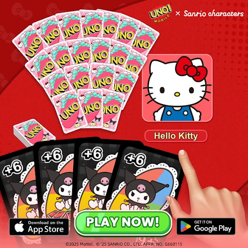
Platform: Facebook, Instagram, Audience Network, Threads
Industry: Mobile Gaming / Casual & Card Games
This static ad from UNO! Mobile Game highlights its limited-edition Sanrio collaboration using a bright background, playful card artwork, and instantly recognizable characters like Hello Kitty.
The headline emphasizes “Limited Edition!”, paired with the message “Collect & play with exclusive Sanrio characters”, which reinforces the theme of scarcity and exclusivity. The ad finishes with a bold “PLAY NOW!” CTA is placed above App Store and Google Play badges for frictionless installs.
Why it works
Stopping power: Using Hello Kitty and Sanrio characters makes the ad instantly recognizable, tapping into a massive global fan base and boosting click intent.
Bright, high-contrast visuals: The strong red palette and colorful card art stand out in the feed, making the creative feel lively and fun, ideal for casual gaming audiences.
Limited-edition urgency: Calling out “Limited Edition” leverages FOMO, encouraging players to download before the event ends. Exclusive content is a proven UA driver for mobile games.
Clear gameplay cueing: Showing in-game cards and a player’s hand gives viewers a quick preview of what the UNO experience looks like, helping users immediately understand the gameplay.
4. Solitaire Game
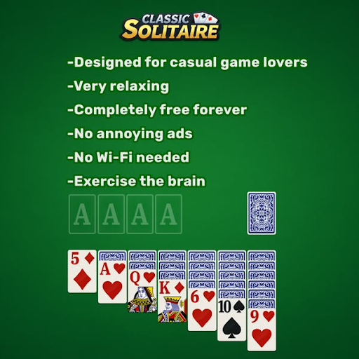
Platform: Facebook, Instagram, Audience Network, Threads
Industry: Mobile Gaming / Casual & Puzzle
This static ad from Solitaire Game uses a simple green background paired with clean white text to communicate the core benefits of the game.
The headline-style copy highlights features such as “Designed for casual game lovers,” “Very relaxing,” and “Completely free forever,” creating a clear value message focused on ease, comfort, and accessibility. The lower portion of the ad shows an in-game tableau, grounding the visual in actual gameplay. A direct “Play game” CTA guides users toward installation.
Why it works
Clear benefit-first messaging: Listing simple, high-clarity benefits (“No Wi-Fi needed,” “No annoying ads,” “Exercise the brain”) appeals directly to the motivations of casual players.
Recognizable classic styling: The green felt background and solitaire layout build instant familiarity, helping users understand the game with a single glance.
Low-friction appeal: Messaging around “free forever” and “no ads” removes common barriers to download, making the offer feel straightforward and risk-free.
Gameplay-focused visuals: Displaying real card arrangements reassures players that the experience is simple, traditional, and exactly what they expect from a classic solitaire game.
5. Spotify
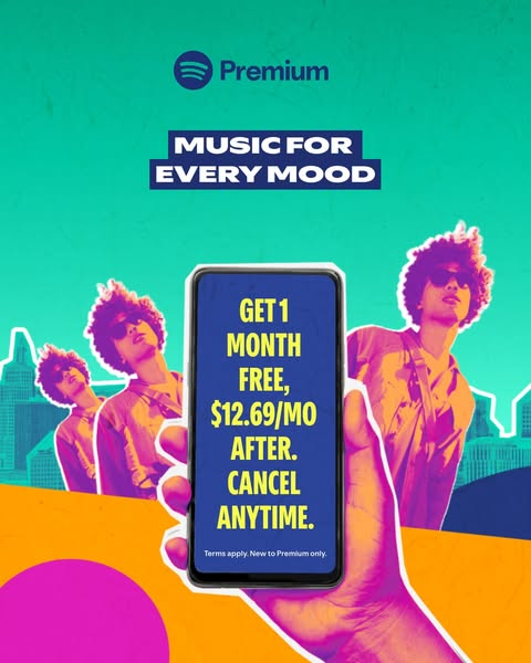
Platform: Facebook, Instagram
Industry: Music Streaming / Subscription
This static ad from Spotify uses a bold, vibrant color palette to highlight its core subscription message.
The visual features a stylized, pop-art–inspired character alongside a prominent mobile screen displaying the offer: “Get 1 month free, $12.69/mo after. Cancel anytime.” The background blends teal, orange, and pink gradients, creating an energetic, youthful feel that reflects Spotify’s creative identity. The ad closes with a clear “Sign Up” CTA to drive conversions.
Why it works
High-impact visual style: The bright pop-art design instantly grabs attention and stands out in feed environments crowded with muted colors. Spotify’s consistent use of bold color blocking strengthens brand recall.
Clear, value-driven offer presentation: Placing the free-trial message directly on a phone screen makes the benefit unmistakable. The “Cancel anytime” line reduces friction and builds trust for first-time subscribers.
Emotion + lifestyle positioning: The “Music for Every Mood” headline appeals to diverse listener needs, from focus to fun to workouts. It frames Premium as a lifestyle upgrade, not just a subscription.
Product experience cue: Showing the mobile device subtly reminds users of how they’ll use Spotify on the go, making the ad feel relevant and practical.
Even though static ads can perform exceptionally well, they also come with constraints that every UA team should keep in mind.
Limitations of Static Ads
Static ads are great for fast testing, but their single-frame format limits how much you can communicate. Without motion or narrative depth, they often struggle to hold attention or deliver complex value.
Key limitations to keep in mind:
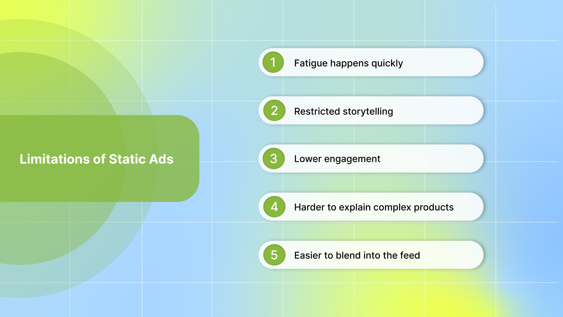
Fatigue happens quickly: Users see the same image repeatedly, causing performance to drop fast. Refresh creatives weekly with new hooks, colors, and formats to maintain performance.
You can also use AI-powered platforms to detect fatigue. With Segwise fatigue tracking, you can catch fatigue before it impacts your budget allocation and campaign results.
Restricted storytelling: With only one frame, you can't show gameplay, app flows, step-by-step value, or product depth. This forces oversimplification, even when your product needs more context. Pair static ads with short videos or carousels to show depth and progression.
Lower engagement: Static ads naturally get fewer interactions than video, UGC, or playables. Use bold colors, big characters, and strong focal points to create instant scroll-stopping impact.
Harder to explain complex products: If your offering needs visual context or progression, one image can’t convey the full benefit, leading users to scroll past without understanding the value. Add clear micro-copy or visual cues that summarize the core benefits.
Easier to blend into the feed: If the design isn’t bold, static ads can look like ordinary posts, losing the critical first second of attention needed for installs, clicks, or conversions. Use high-contrast layouts or native-style UGC snapshots to stand out immediately.
Also Read: How to Combat Creative Fatigue with AI Solutions
Conclusion
Static ad performance depends entirely on how intentionally each element is designed. From scroll-stopping visuals to emotion-led storytelling and data-backed creative choices, winning static ads in 2026 require clarity, strong value framing, and smart testing. The examples and strategies show exactly how top brands and UA teams turn a single image into a high-performing acquisition asset.
If you want to see the power of data and unlock deeper insights behind what makes your static ad creatives win, an AI-powered platform like Segwise can completely transform your workflow.
Our AI creative tagging can automatically identify and tag creative elements such as hook dialogs, characters, colors, and audio components across images, videos, text, and playable ads to reveal their impact on performance metrics like IPM, CTR, and ROAS. Moreover, beyond our 20+ standard creative tags, you can customize your tags for specific elements that are unique levers to your creative performance.
With creative analytics, you don't need to jump between Facebook Ads Manager, Google Ads, TikTok, and your MMP dashboard. See creative-level ROAS, CPA, LTV, and conversion rates from all sources in one unified view. With tag-level creative element mapping, you can see which specific creative elements drive performance. Discover patterns like "this hook dialog appears in 80% of our top-performing creatives."
You can also track fatigue to catch performance drops before it impacts your ROAS. With AI creative generation, you can create multiple new ad creative variations with a click of a button, using your proven winning creative elements like hooks, CTAs, visual styles, etc., that actually drive ROAS and conversions.
So, are you ready to level up your static ads with data-driven clarity? Start your free trial and see how fast your creative performance can improve!
FAQs
1. What makes static ads still relevant in a world dominated by video?
Static ads remain valuable because they load faster, cost less to produce, and are easier to test and scale across platforms than video and interactive formats, especially for top-of-funnel campaigns.
2. Should static ads use text-heavy copy?
No, most high-performing static ads use minimal, benefit-driven text so viewers grasp value in under a second, which is crucial on fast-scrolling social feeds.
3. What role does social proof play in static ad performance?
Including elements like ratings or customer counts in static ads can boost credibility quickly, increasing trust and conversion rates without much design complexity.

Comments
Your comment has been submitted