Winning Creative Patterns in Dating App Ads: What 200+ Ads Teach Us
The top-performing dating app ads of 2026 are not the loud ones. Across 200+ high-performing creatives tagged on 78 dimensions, the patterns that show up most often are relatable everyday moments (42.9% of ads) over bold claims (11.7%), real human faces (82.9%), social proof (29.3%) instead of discounts (1%) or urgency (0%), and a single text call to action that lands late, around the 18-second mark. If you are testing dating creative this year, the prevalence of these elements among winners is the closest thing to a map you will get.

Also check out other Segwise Winning Creative Pattern Reports HERE
Introduction
The dating category is having a strange year. The market itself grew to $11.61 billion in 2025 and is on track for $12.52 billion in 2026, but the giants are shrinking inside it. Tinder, Bumble, and Hinge all posted double-digit revenue declines through the first three quarters of 2025, while Bumble's paying users dropped 16% year over year. The growth is leaking out to niche apps and to whoever can acquire users more efficiently.
Efficiency in this category comes down to creative. Targeting is mostly commoditized, the platforms automate the bidding, and the one lever you still fully control is what the ad actually shows and says. So we did the obvious thing for our Winning Creative Patterns in Dating Apps report: take 200+ of the best-performing dating app ads, tag every creative element, and look at what the winners keep doing.
One note on method before the patterns, because it matters. This analysis measures prevalence, how often a given element appears, not a controlled lift test. The reason prevalence is still useful here is that the sample is drawn from top-performing ads. When an element shows up in the winners far more than its opposite does, that concentration is a strong signal of what is working in the category right now. Treat these as well-supported starting hypotheses for your own testing, not as laws.
Also read How to Find Your Next Ad Angle: A 4-Source Customer-Language Mining Framework
Key Takeaways
Relatable, everyday framing dominates winning dating ads (42.9%), roughly four times more common than bold claims (11.7%) or problem-led angles (11.2%).
Faces are almost mandatory: 82.9% of top ads show a human face, and the modal subject is a woman aged 20 to 34 (64.9% female, 90.2% in that age band).
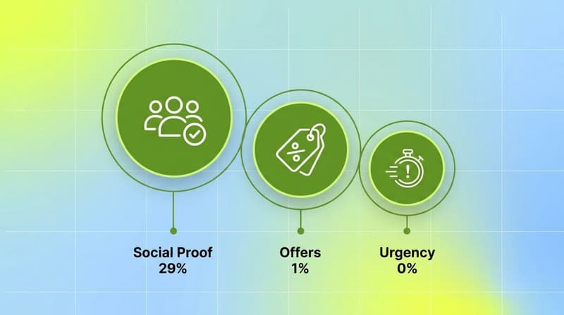
Trust beats incentives. Social proof appears in 29.3% of winners, while discounts (1%) and urgency or scarcity (0%) are essentially absent.
The call to action is usually on-screen text (72.2%), not voiceover (29.8%), and it arrives late, around 18 seconds in, after the ad has earned attention.
More than half of these ads use a UGC or creator-style look (55.5%), which lines up with broader 2026 data showing unscripted UGC converting 2 to 3x better than polished brand creative.
The dataset: 200+ top ads, 78 tagged dimensions
Every ad in the set was tagged across 78 creative dimensions: the hook, who appears on screen, where it is filmed, the emotional tone, the messaging angle, the call to action and when it shows up, the visual style, and dozens more. Two kinds of numbers come out of that. For single-choice dimensions, like the primary messaging angle, the percentage is a share of creatives. For dimensions where an ad can carry several tags at once, like on-screen elements, the percentage is a share of mentions. I will flag which is which as we go.
The point of tagging at this depth is that "what makes a good dating ad" stops being a vibe and becomes a list you can test against. Here are the five patterns that came through most clearly.
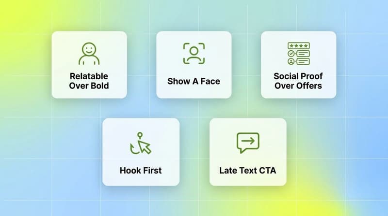
Pattern 1: Relatable beats bold, by a wide margin
The single most common messaging angle in winning dating ads is the relatable everyday moment: a real-feeling text exchange, an awkward first date, the friend-group group chat. It shows up in 42.9% of the set. Bold claims ("the dating app that actually works") sit at 11.7%, and problem-led openers ("tired of getting ghosted?") at 11.2%. Relatable wins by roughly four to one over either alternative.
This is not a dating-only quirk. It tracks with what creative teams are seeing across categories in 2026, where authenticity consistently outperforms polish and unscripted, phone-shot content converts multiples better than studio work. In a category built entirely on trust, a polished brand ad can read as the opposite of trustworthy. The relatable angle sidesteps that. It does not sell the app, it shows a moment the viewer recognizes.
If your dating creative leads with a bold performance claim, the data is not saying that never works. It is saying you are fishing in the 11.7% pond while the winners crowd into the 42.9% one.
Pattern 2: Show a face, and usually a specific one
82.9% of top ads put a human face on screen. That is the most consistent visual rule in the entire set, and it makes sense: faces stop the scroll, and a dating product is fundamentally about people.
It gets more specific. The subject skews heavily female (64.9%) and overwhelmingly young, with 90.2% of identifiable subjects in the 20 to 34 age band. That is not a casting instruction so much as a mirror of the audience these winners are speaking to. The relevant takeaway is the first frame: with attention won or lost in the first few seconds of a scroll and the opening frame often playing without sound, a recognizable human face doing something human is almost certainly doing a lot of the work before a single word is read.
The anti-pattern here is the logo-and-gradient opener, or the abstract UI montage with no person in it. Those are rare among winners for a reason.
Pattern 3: Social proof over offers and urgency
Here is the gap that surprised me most. Social proof, meaning testimonials, success stories, "I met my partner here" framing, appears in 29.3% of top ads. Discounts and offers appear in 1%. Urgency or scarcity ("limited time," "ending soon") appears in 0%.
Zero is a strong number. It says the winning dating playbook has essentially abandoned the classic performance-marketing levers of discount and countdown. That fits the category. You cannot put a "50% off" sticker on finding a relationship, and a fake-urgency timer on a dating app reads as desperate. What builds conversion instead is evidence that the thing works for people like you, which is exactly what social proof does to buyer resistance: it lowers it by showing real people who already chose the product.
For most performance marketers trained on ecommerce, this is the hardest pattern to internalize. The instinct is to add an offer. The winners say: add a person and their story instead.
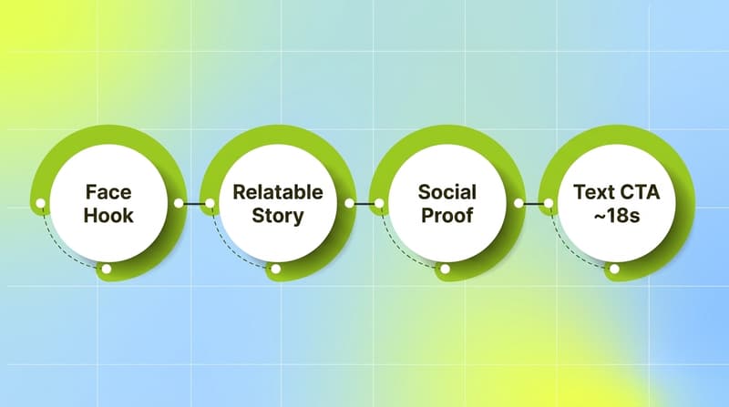
Pattern 4: The hook earns the first few seconds
The opening of these ads is doing a specific job, and it is not "introduce the brand." Winning dating creatives front-load a relatable or curiosity-driven moment, then let the product show up later. That maps directly to hook-rate math: a healthy hook rate sits around 25 to 30%, and anything above 40% is rare enough to scale safely, where hook rate is the share of impressions that turn into a 3-second view.
What that means in practice, looking at the set: the first frame works without audio, a face is usually present, and the ad does not waste its opening on a logo. The "first few seconds" framing is deliberate. It is not a hard 3-second cutoff, it is the window where the ad either earns the next 20 seconds or gets scrolled past.
Pattern 5: One text CTA, and it comes late
The call to action in winning dating ads is overwhelmingly visual. On-screen text CTAs appear in 72.2% of the set and spoken or voiceover CTAs in 29.8% (an ad can use both, so these overlap). The most common ask is a straight "download" or "install" prompt (56.6%).
The timing is the interesting part. The first clear CTA tends to land around the 18-second mark. These ads do not open with the ask. They spend the first two-thirds building the relatable moment and the social proof, and only then point you to the app store. The structure is: earn attention, build trust, then direct the action. An on-screen text CTA fits that because it can sit quietly in the corner or appear as a clean end card without interrupting the story the way a hard voiceover pitch would.
If your ads ask for the install in the first five seconds, you are inverting the pattern the winners use.
What this means for your 2026 creative testing
Put the five together and a clear brief falls out. Open on a real face in a relatable moment that works on mute. Build trust with social proof rather than discounts. Keep the look UGC-style (55.5% of winners do). Hold the install ask until you have earned it, around the 18-second mark, and deliver it as on-screen text.
The catch is volume. Knowing the winning pattern does not exempt you from creative fatigue, and dating creative fatigues fast. A Meta study found click likelihood drops 45% after just four exposures to the same ad, Instagram Reels burn through creative weekly, and teams spending at scale need 10 to 14 fresh creatives a week just to hold position. So the real job is not finding one winner. It is producing many variations on the winning pattern, fast, and killing them before they decay.
That is the loop most teams break on. Tagging every creative by hand to learn which elements drove the win, then briefing the next batch, then re-tagging, is the work that quietly eats 20-plus hours a week.
How to find these patterns in your own ads
The five patterns above came from one category. Yours will be different, and the only way to know your winning pattern is to tag your own creatives at this level of detail and map each tag to performance. That is exactly the gap Segwise is built to close.
It connects to your ad networks and MMPs (Meta, Google, TikTok, Snapchat, YouTube, AppLovin (Axon), Unity Ads, Mintegral, IronSource, plus AppsFlyer, Adjust, Branch, and Singular), then uses multimodal AI to automatically tag every creative element across video, audio, image, and text, the same way the dating set was tagged. Each tag is mapped to your actual performance metrics, so "relatable beats bold" stops being someone else's finding and becomes a number on your own account. It is also the only platform that tags playable ads, which matters if you run interactive formats.
Teams using this approach save up to 20 hours a week per app on manual tagging and data wrangling, and the tag-to-metric read is what catches fatigue before it burns budget. From there the creative generation side turns the winning tags back into net-new creatives and storyboards, which is how you keep up with a weekly refresh cadence without doubling the design team. Customers report up to 50% ROAS improvement from finding winning patterns earlier and catching fatigue sooner, and roughly half the usual creative production time.
Conclusion
The 2026 dating ad that works looks less like an ad and more like a moment: a real person, a relatable beat, a quiet proof point, and a single clear ask that waits its turn. Bold claims, discounts, and countdown timers are not where the winners are spending their attention. That is a useful map for the dating category specifically, and a good reminder generally that the patterns hiding in your top performers are usually more specific, and more counterintuitive, than the playbook you inherited.
The only way to act on it is to read your own data at the creative-element level. Tag your ads, map the tags to performance, and let the winners tell you what to make next.
FAQs
What does it mean that this analysis measures prevalence, not performance?
Prevalence is how often a creative element appears across the set. This study counts prevalence within 200+ top-performing dating ads. Because the sample is already filtered to winners, a high prevalence (and especially a lopsided one, like relatable at 42.9% versus bold at 11.7%) is a strong proxy for what is working in the category. It is a starting hypothesis for your own testing, not a controlled lift result.
Why do relatable ads beat bold claims in dating?
Dating is a trust-driven purchase, and polished bold claims often read as inauthentic in a category where authenticity is the product. Relatable, everyday framing shows a moment the viewer recognizes instead of selling at them, which is why it appears in 42.9% of winners versus 11.7% for bold claims. It also matches the broader 2026 trend of unscripted, authentic creative outperforming polished brand work.
Should dating app ads use discounts or urgency?
The data says no, at least among top performers. Offers appear in just 1% of winning dating ads and urgency or scarcity in 0%. You cannot discount a relationship, and fake urgency undercuts trust. Social proof (29.3%) is the lever winners use instead.
When should the call to action appear in a dating video ad?
In this set, the first clear CTA tends to land around the 18-second mark, after the ad has built a relatable moment and shown social proof. The ask is usually on-screen text (72.2% of ads) rather than voiceover (29.8%), most often a straight download or install prompt.
How many creatives do I need to keep up with fatigue?
It depends on spend and platform, but fatigue is real and fast: a Meta study found click likelihood can drop about 45% after four exposures, and Reels often need weekly refreshes. Teams spending at scale commonly ship 10 to 14 new creatives a week. The practical move is to produce many variations on your proven winning pattern, not to hunt for a single perfect ad.
How do I find the winning creative patterns in my own ads?
Tag every creative by its elements (hook, faces, tone, CTA, format, and so on) and map each tag to your performance metrics. Doing this by hand is slow, so most teams automate it. Segwise connects to your ad networks and MMPs, tags creatives with multimodal AI across video, audio, image, and text, and maps each tag to performance so your own winning patterns surface automatically.

Comments
Your comment has been submitted